Scary Hotel 10 Year Anniversary
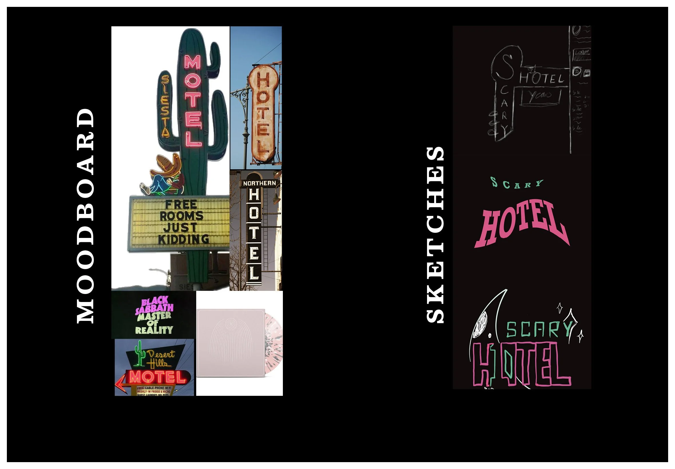
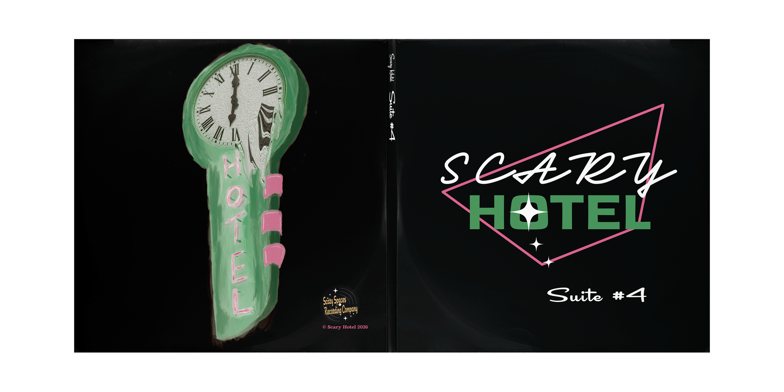
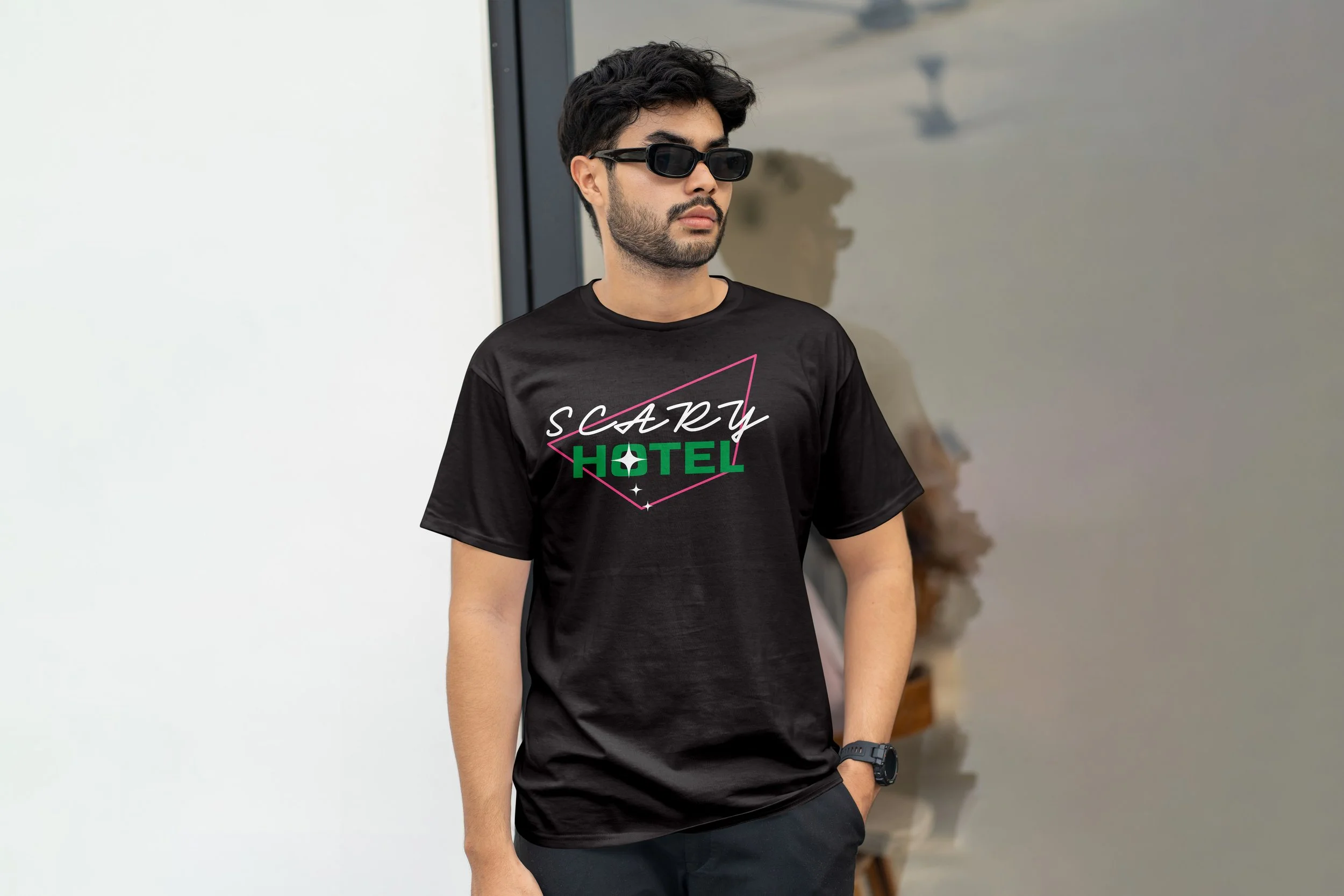
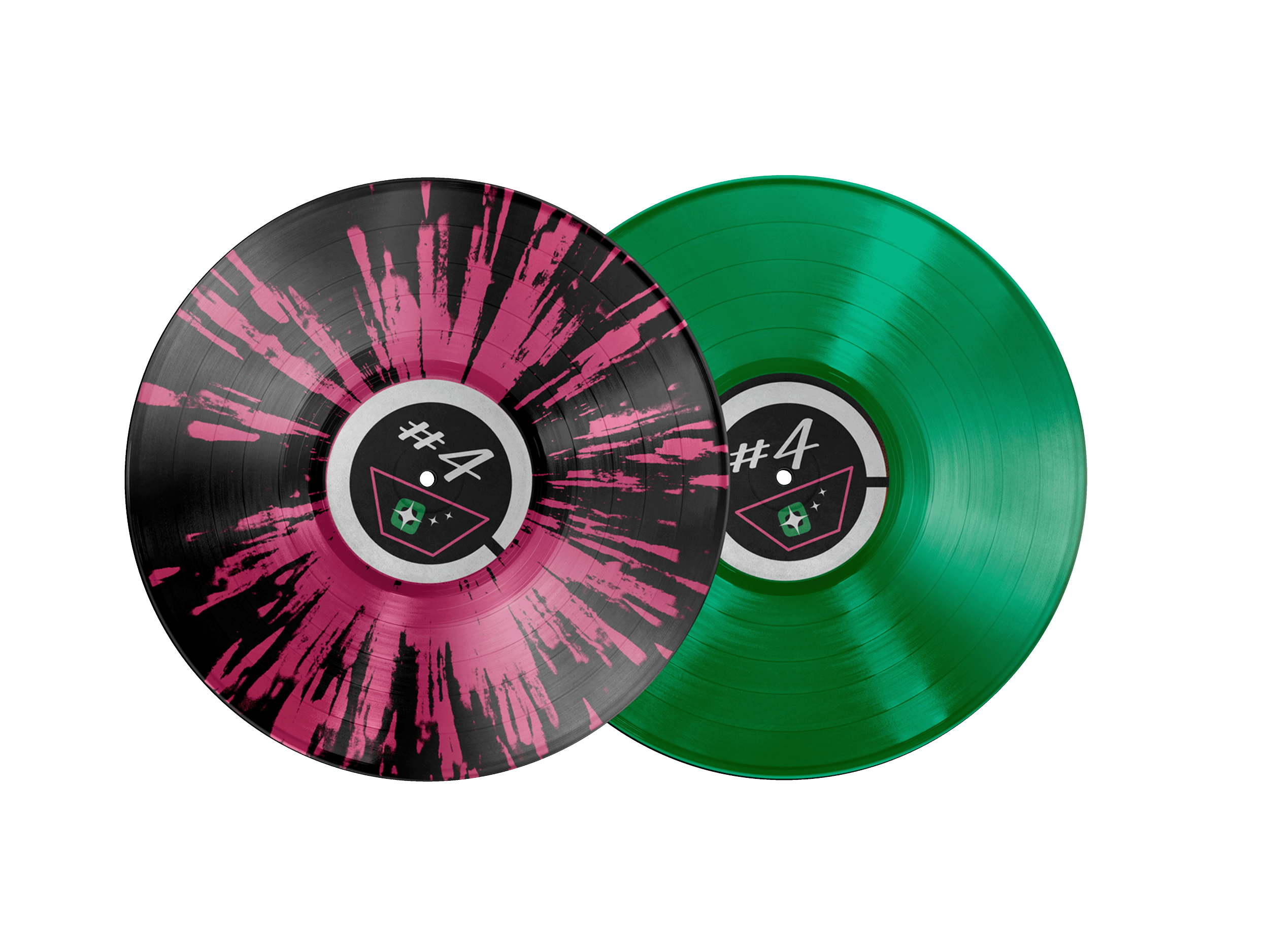
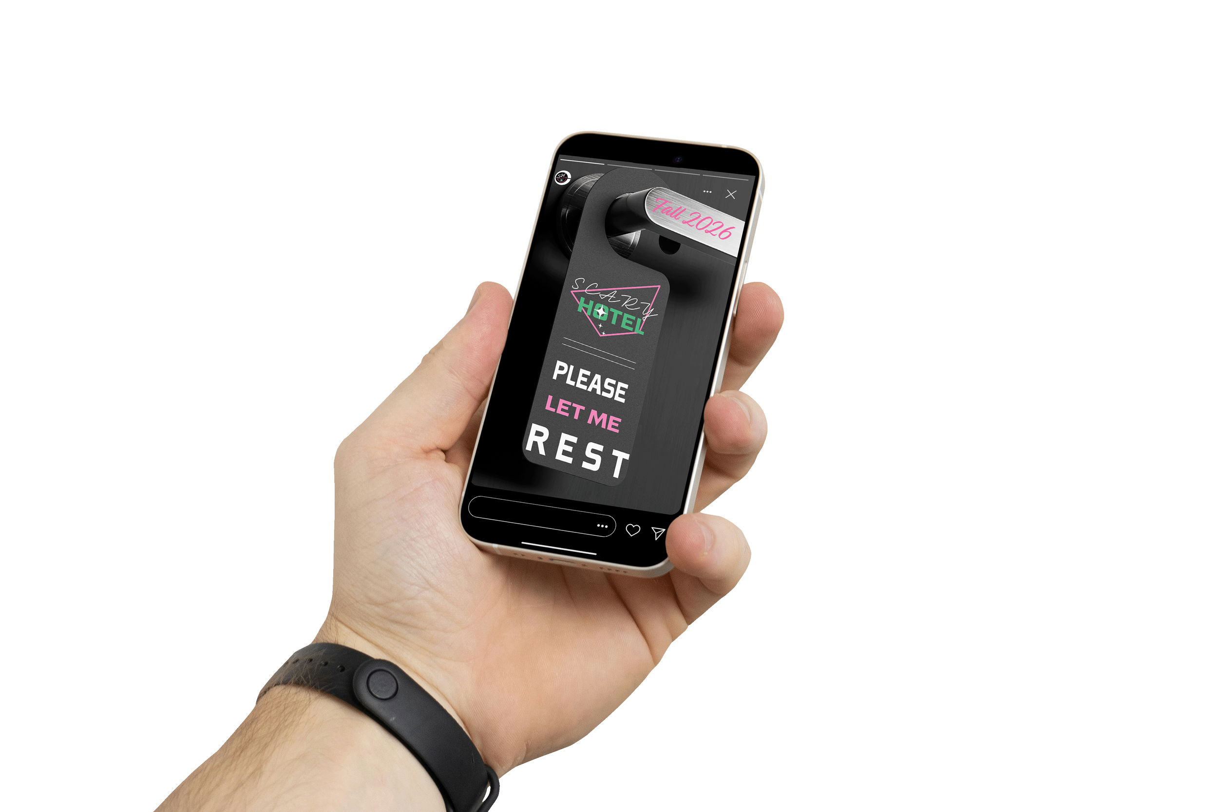
These designs are inspired by mid-century hotel signs. The type and color palette of the cover art is meant to evoke the neon of vintage Americana roadside inns. The shape is that of a tilted martini glass, implying a classy but playful nature. The “O” in “hotel” represents the olive commonly seen in classic cocktails. This can be used as its own branding element, as seen in the sticker design. The classic “do not disturb” door hanger shape is another element, adding consistency to the album cover design and merchandise.